
Top 10 metrics for a Product Team
And how to start measuring them

Introduction
Metrics are crucial to strategise, take the best decisions, identify risks before they become reality or even just celebrate your team’s success. Tracking the right metrics is becoming harder with too much data to keep a cold head. This reflects directly on the market as we witness a growing demand for data-driven product managers (we even heard the term engineer-PMs…). Why is that? Product managers must constantly find innovative ways to increase revenues, gauge product usability, increase customer loyalty and product performance. With ever-growing data, the need to understand, digest and react quickly on the product data is as critical, as having someone who puts in place the correct KPIs to make sense of this data. On top of that, you need someone capable of bridging the gap between all teams: a product manager which speaks the same language as business, technical and management teams.
Today, we’ve brought to you the top 10 metrics your data-savvy product team should absolutely track to ensure you are extracting 100% value out of your product, in other words monitoring the success of your company.
As shown below, those KPIs span the full product production chain.
Monthly Recurring Revenue
Customer Lifetime Value
Customer Acquisition Cost
On-time Delivery
Team Velocity
DAU/MAU ratio
Session Duration
Onboarding Time to Value
Churn Rate
Net Promoter Score

1. Monthly Recurring Revenue (MRR)
What is it?
💡 The Monthly recurring revenue measures your product’s total revenue over the course of one month.
Why is it important?
Sometimes deemed to be the most important metric out there for financial growth, the MRR will allow you to gain key insights into the subscription behaviour of your customers. The MRR has gained great popularity because it tracks your business’s performance, it allows for easily planning and forecasting your growth and finally it makes budgeting more transparent: you immediately know what to expect in revenue from your platform at any given month in time.
How to calculate it?
To measure MRR every month, you should start with the MRR at the end of last month, add the revenue from new subscriptions and subtract the churn from customers lost this month.

What does it look like?
When looking at the MRR, we should look at its trend over time. This trend will reveal critical information about the health of your product as it is directly related to the amount of revenue coming in. This trend will help management with decision making, scaling the business and predictability.
2. Customer Lifetime Value (CLV)
What is it?
💡 The Customer Lifetime Value is a metric indicating the total value a business can reasonably expect from a single customer account throughout the business relationship.
Why is it important?
Measuring Customer Lifetime Value is key, as it allows you to recoup the investment required to earn a new customer. It allows you to predict future revenue and measure long-term business success. This metric is key for acquiring and retaining highly valuable customers. It is also a great metric to compare with Customer Acquisition cost. In fact, you better ensure Customer Lifetime Value is higher than Customer Acquisition costs. Otherwise, you might well be wasting your resources.
How to calculate it?
Customer Lifetime Value is calculated by adding the costs associated with converting prospects into customers (marketing, advertising, sales personnel, and more) and dividing that amount by the number of customers acquired. This is typically figured for a specific time range, such as a year or a fiscal quarter.

With:
- Average purchase value — the value of all customer purchases over a particular timeframe (a year is usually easiest), divided by the number of purchases in that period
- Average purchase frequency — divide the number of purchases in that same time period by the number of individual customers who made a transaction over the same period
- Average customer lifespan — the average length of time a customer continues buying from you
What does it look like?
You should be displaying the Customer Lifetime Value as a trend. In fact, observing how this trend evolves reveals a lot about your ability to retain customers and exploit existing customer relationships. As mentioned above, it is also interesting to compare the Customer Lifetime Value with other numbers, such as the Customer Acquisition Cost to gauge your profitability.
3. Customer Acquisition Cost (CAC)
What is it?
💡The Customer Acquisition Cost is the amount of money it costs your company to acquire a new customer.
Why is it important?
This is one of the first metrics you’ll want to measure. Measuring this metric allows you to make important decisions for keeping your company afloat. For example, you don’t want to be spending too much money on customer acquisition if it doesn't yield a profit. This metric helps you decide how much money should be spent on attracting customers while keeping your company profitable.
How to calculate it?
CAC is calculated by adding the costs associated with converting prospects into customers (marketing, advertising, sales personnel, and more) and dividing that amount by the number of customers acquired. This is typically figured for a specific time range, such as a year or a fiscal quarter.

What does it look like?
When looking at Customer Acquisition Costs, looking at a number at a specific point in time won’t get you far. It should be displayed:
- As a trend, allowing to understand the evolution of the acquisition cost. It tells you nothing to know that your customer acquisition cost is $10. However, it tells you a lot to know that your CAC is $10 today while it was $5 last year. Analysing this trend allows you to compare your performance over different time periods.
- In constant comparison with the value yielded by customers. If the customer acquisition cost is $10, while each customer brings about a value of $7, you’re clearly doing something wrong.
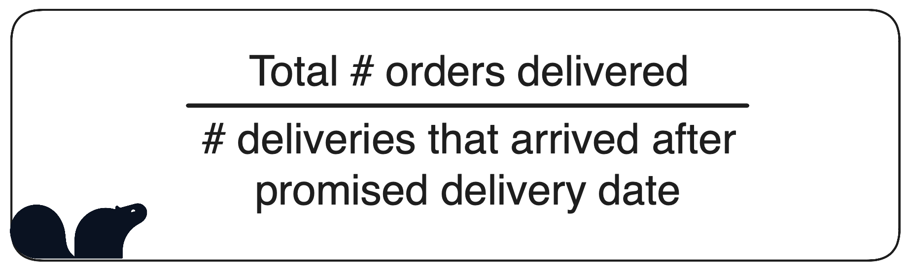
4. On-Time Delivery
What is it?
💡 Delivery on time tracks the performance of your product against time commitments, it ensures your team commits to their development timeliness and increases customer loyalty.
Why is it important?
Measuring on-time delivery of your product is critical to increase your customer retention and revenue. The metric is key to building customer relationships. This metric also reveals bottlenecks in your team’s development process. In general, issues that emulate from on-time delivery problems touch inventory, order supply and delivery issues. Tracking this metrics allows your team to catch gaps, adjust and prevent customer impact.
How to calculate it?
OTD is often measured within a date range.
What does it look like?
Again, the on-time delivery metric should be displayed as a trend. In fact, you need to be able to compare the delivery issues or improvements across different time periods to be able to detect for example seasonality patterns and prevent them in the future.
5.Team Velocity
What is it?
💡 The Team Velocity metric is the average amount of work your product team produces in one sprint. It is what we call an “Agile” work method.
Why is it important?
Team velocity is used to estimate the amount of work and delivery date of product features/developments. It is useful for planning but should be used with caution. When correctly monitored and reported, the metric allows product managers to validate roadmaps and estimate how much time upcoming projects will take.
How to calculate it?
We calculate team velocity by counting the total units of work in a certain time period (usually between 1-3 weeks). Velocity is always measured at a team level.
We must also define story points, which are points allocated to different tasks within a user story.

An example would be: XYZ product team finished 15 stories during a two-week sprint. The team had previously defined that each story has a value of 4 story points each. Then the team’s velocity is 45 story points/sprint.
What does it look like?
Again, velocity tends to be displayed as a trend. This allows your team to have an idea of the “historical velocity” i.e. visualise the progress of your team. It sometimes is plotted next to an “ideal” scenario trend to compare performances.
6. DAU / MAU Ratio
What is it?
💡 The Daily Active User (DAU) / Monthly Active User (MAU), represents the number of active users/subscribers per day or month. A unique user visits an application or website at least once within a period of time.
Why is it important?
What really maters here is the active part of DAU or MAU. It is deemed to be, after revenues, the most valuable metric of product growth. The metric is helpful to evaluate the traction of your product by giving context to the level of engagement of your users. It is directly related to user retention. The ratio can be used then to forecast, budget or take decisions to develop new features or cease others in product development.
How to calculate it?

With:
Daily Active User (DAU) – “Active users” are customers who signed on the product and performed tasks. This is, to some extent, subjective to your product and depends on what user actions you consider important on a daily basis.
Monthly Active User (MAU) – “Active users” are customers who complete certain tasks per month. This is, to some extent, subjective to your product and depends on what user actions you consider important on a monthly basis.
What does it look like?
Simply put, the higher the ratio, the sticker the product is. DAU/MAU ratio is one out of many metrics measuring customer activity. It is for that reason, that it is always better to track this ratio alongside other KPIs as user retention, CAC and churn rate. The ratio can also be dependent on industry benchmarks (i.e. social apps are very sticky vs. travelling apps).
7. Session duration
What is it?
💡 Session duration represents the time a user spends on your product, on average.
Why is it important?
Session duration is a good kick-start to identify whats works and what doesn’t with your product. It helps you track your customer journey.
How to calculate it?

What does it look like?
The session duration KPI can be tracked using histograms displaying how much time each cluster of consumers spend on your product. In fact, you need to be able to compare the churn rate across different time periods but also across different groups/types of consumers.
8. Onboarding Time To Value
What is it?
💡 The onboarding time to value metric is how long it takes for users from inception of onboarding to extract value from your product.
Why is it important?
This metric is crucial to track as it has a direct impact on your revenues (by reducing redundant/unnecessary onboarding costs) and on your customer retention. The analysis that comes out of this metric will help you increase the frequency of usage of your product as well as increase conversions. Put simply, the sooner your customer feels the value, the less likely is he to abandon your product. A low TTV translates into a faster return on investment.
How to calculate it?
There are different ways to measure time to value. Of course, it is dependent on your customer’s definition of value and their needs, as well as your business model. Generally speaking, we measure the TTV by:

What does it look like?
Time to value is complex to compare as it is highly dependent on the industry, the different clusters of your clientele and your product at hand. Product teams usually visualise Time to Value on a dashboard to witness its’ evolution over time.
9. Churn Rate
What is it?
💡 Customer Churn refers to the number of customers you’re losing in a predetermined time period.
Why is it important?
Churn rate allows you to know how many customers are deciding to leave the business and helps you understand how this is impacting revenue.
How to calculate it?
To calculate churn rate, you’ll have to know the number of customers you had at the beginning of the time period and the number you lost over this same time period. You then divide the number of lost customers by the number of total customers at the start of the time period. Finally, multiply this number by 100 to obtain a percentage.

xample: if your business had 250 customers at the beginning of the month and lost 10 customers by the end, you divide 10 by 250. The answer is 0.04. You then multiply 0.04 by 100, resulting in a 4% monthly churn rate.
What does it look like?
Your churn rate should be displayed as a trend. In fact, you need to be able to compare the churn rate across different time periods. This allows noticing when there is a spike in the churn rate so that you can act quickly upon it.
10. Net Promoter Score
What is it?
💡The Net Promoter Score (NPS) is for your customers to score the quality of your product’s service. It gives a sense of the number of loyal customers, who recommend your product versus customers who dislike your product.
Why is it important?
Bain & Co., the initiators of the metric, have established that a good NPS can yield 20-60% of organic growth. This tell us already indicates the importance of being aware of your NPS. But also, there is a strong correlation between your employees’ motivation, reaction and involvement in your product with the NPS. This metric allows companies to constantly build awareness and improve the experience of their customers: it is a good business health indicator.
How to calculate it?

- Promoters: users who score your product and service between 9-10 points
- Detractors: users who score your product and service between 0-6 points
- Others are called neutrals and are users who score your product and service between 7-8 points
How does it look like?
The NPS score is usually looked at on a scale from -100 to 100. Most frequently, it should be also studied as a trend in order to depict your customer’s satisfaction over time. Bear in mind that it is important to know your industry and its’ benchmark as NPS may vary considerately across industries.
Subscribe to the Castor Blog
About us
We write about all the processes involved when leveraging data assets: from the modern data stack to data teams composition, to data governance. Our blog covers the technical and the less technical aspects of creating tangible value from data.
At Castor, we are building a data documentation tool for the Notion, Figma, Slack generation. We designed our catalog software to be easy to use, delightful and friendly.
Want to check it out? Improve your data monotoring. Try a free 14 day demo of CastorDoc.

You might also like


Get in Touch to Learn More


“[I like] The easy to use interface and the speed of finding the relevant assets that you're looking for in your database. I also really enjoy the score given to each table, [which] lets you prioritize the results of your queries by how often certain data is used.” - Michal P., Head of Data
