

How do companies deal with dashboard rot?
and why 95% of BI dashboards are broken?

A common problem
I remember my first days as a data scientist at Ubisoft in San Francisco. Ubisoft is a video game company. They are creators of Assassin's Creed, Watch Dogs, The Division, Far Cry etc. I was so excited to look into players' behavior in-game. Haven't you always dreamt of knowing how many steps people did on average in Assassin's Creed Valhalla? What's the most popular song on Just Dance? Well, I am the curious type and was dying to answer those questions all day long. Yet, I am also the lazy type so I was looking to leverage work done by others. I hate doing work that's already been done by others.
Long story short, I spent my first weeks exploring all the Tableau dashboards that were already designed. I ended up really disappointed because BI tools weren't optimized for content consumption, especially at scale or in self-served data organization. I spent days finding the dashboards I was interested in.
The Dashboard Problem
A dashboard is a graphical representation of tabular data

Really useful to monitor business health on a day-to-day basis. You get a great deal of information at a glance. It sounds (and is!) great.
But as data grow, more people create more dashboards and it's quickly a mess.
.png)
Important things are not obvious anymore. Finding relevant analysis gets tricky. People are lost and start hating their BI tool.

As data consumer
I was surprised by a few things regarding BI tools. Here's the gist :
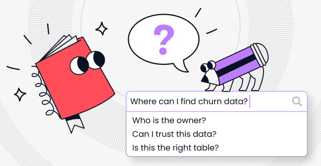
I couldn't explore dashboards efficiently
- I couldn't trust any of them without a thorough 30-min analysis
- I had no idea which ones were used a lot or business critical
- I spent hours finding out what were the tables feeding the dashboards
- I had to ask data engineers to know when was the last refresh
As a data manager
Last year, I met Arnaud de Turkheim and Amaury Dumoulin, heads of data at Payfit and Qonto. As data managers, they felt overwhelmed when dealing with BI tools. In a few words, the more they deployed self-served BI, the more they lost control, and trust in dashboards :
- No visibility on access rights
- No visibility on usage
- No visibility on dependencies
- Extremely hard to clean
- No knowledge of which ones are important
- No knowledge of which ones are duplicates
That was the dark side of dashboarding. Good news is there's a good side to it. Let me take you through the various good practices I've seen in customer interviews.
Good practices we saw
BI tools are very powerful, which means people can certainly find ways to create a confusing environment for end-users. Below are a few common good practices that can help you deploy self-service BI tools without losing control.
🔬 Set up a simple governance from day 1

One folder per team, one subfolder called playground, and to get out of the playground, the data team needs to:
- approve the analytical logic
- approve that it is not a duplicate
🚰 Use 'popularity' to filter out dashboards
Archive frequently dashboards that are not used but reassure data people that these can be put back easily.
We can also use a [deprecated] prefix on the dashboard / visualisation names to mark for deletion.
🧶 Data modelling outside of BI tools
Transform most of your data inside the data warehouse with dbt. This will help you :
- maintain a single source of truth for data modeling
- encourage collaboration of data analyst, validation by data engineers instead: smoother than query by Data Analyst, integration by Data Engineers
- leverage the ability to join all data
- reduce the complexity of the ingestion: separation of concerns.
🎯 Find the right mix: centralized vs embedded data team
Each of those have advantages and problems.
Centralized data teams are easier to manage and organize. But they are also slower as you need to communicate your business needs more accurately.
Embedded data teams are more agile, more operational in their analysis, and are closer to business needs: they get things done quickly but not in a scalable way. It is really hard to keep a unified source of truth when it comes to data and vision.
👮 Have a clear process for how and where to save content
If your instance is the wild-west of users saving content anywhere they please, content redundancy, difficult clean-up, and ever-lasting confusion are likely to ensue. Set a standard of content hierarchy: how and where you’d like users to save their content to help keep everyone on the same page.
🦻 Collaborative feedback is powerful

You want useful dashboards to be in the spotlight. It's good for morale: BI analysts feel rewarded for their hard work and it is easier to navigate across hundreds of dashboards.
🕵️♀️ Implement test and quality checks
Every BI analyst dreads the idea of top managers asking "This dashboard seems off, what's going on?" and realizing the data pipeline feeding the dashboard broke.
You want to be the first aware of the problem. You will want know why and when your dashboard broke.
Looker-specific good practices
- Do not expose too many explores
- If all users are able to see all the explores in your instance, they can easily become confused. It is important to give users access only to what they need to do their jobs. If you have niche explores, consider hiding them from users who don’t need them.
- Do not use one giant explore
- Having one giant explore with everything can cause content overload and confusion. It is important to name your dimensions and measure things that actually make sense. The more clear and specific you are with naming, the better. Additionally, be sure to use ‘group’ and ‘view’ labels in order to better organize the field picker for your end-users.
Can a tool make it easier?

Having a good data governance strategy is a combination of three things:
- great people
- well-thought processes
- a delightful tool
Missing one part could make data governance a real pain to enforce.
There are things that a tool can automate
- Indexation of assets
A powerful search on top of your BI tool to help users browse through thousands of dashboards.
- Freshness
Show when the dashboard was last refreshed next to the documentation.
- Popularity
Prioritize results and data assets based on people's consumption. Never end up looking at last years' deprecated MRR dashboard.
- Lineage
'I only trust what I can see'! Knowing what are the tables and queries used to create a dashboard is essential to make sure you can trust it. By understanding downstream impacts, data engineers can communicate with the BI team to ensure they won't break important dashboards. Read more on data lineage use-cases here.
- Tests and quality checks
The problem with dashboards: you don't see what data flows in, you just see the output. Unless you write test and quality checks you won't know your dashboard is wrong until it's too late.
- Identify duplicates and deprecated assets
Save time and money by removing data assets that are not relevant anymore. This improve the overall state and readability of your BI tool.
There are things that a tool can ease
- Enforce processes
Make sure every relevant person receives a notification when they should give their input.
- Collaboration
Communicate with data people close to the data sources so that none of the relevant information gets lost in a Slack thread or in a coffee break.
- Rights managements
Having an overview of data warehouse and BI tool rights can help you detect unlawful data usage.
Now, the question is simple.
Why haven't you deployed Castor yet?
Castor is the best tool to deal with dashboard rot. It enables data managers to scale a self-service analytics stack without losing control of data assets (data warehouse and BI tools). If you're looking for more insights, check out our blog to learn more.

Subscribe to the Castor Blog
.png)
You might also like


Get in Touch to Learn More


“[I like] The easy to use interface and the speed of finding the relevant assets that you're looking for in your database. I also really enjoy the score given to each table, [which] lets you prioritize the results of your queries by how often certain data is used.” - Michal P., Head of Data
