

How to measure the ROI of your data team?
Justifying spend in a data team

I. Why is measuring the ROI of your data team so important?

I find it baffling that although data teams spend their days quantifying everything, they still have a hard time quantifying their own performance.
The issue is that data teams can’t do away without proving they have a significant, measurable impact on businesses. And that’s for very simple reasons. Data teams need consequential investments to operate efficiently. And we know investments usually need thorough justification. For this simple reason, you will only ever be able to negotiate a budget, invest in tooling or grow your data team if you can justify the economic impact of your data team. You probably know that already. The question is: how to measure this impact?
The matter has already received some thought. In fact, Benn Stancil, Mikkel Dengsøe and Barry McCardel have proposed three insightful frameworks for measuring data teams’ ROI.
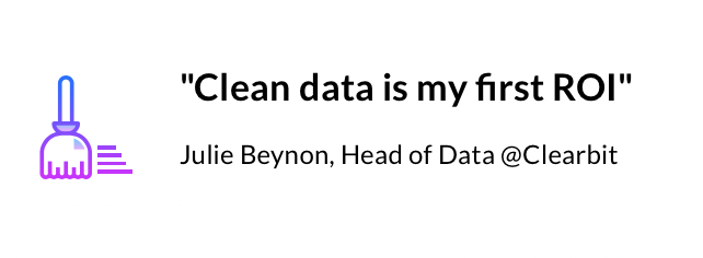
Through a discussion with Julie Beynon, Head of Data at Clearbit, and Kelli Hill, Head of Data at Khan Acadamy, we’ve sought to understand how these frameworks apply in practice. This helped us identify actionable steps, which should allow you to measure your data teams’ ROI in an easy and meaningful way, taking into account the size and maturity of your team.
II. Why is measuring data team’s ROI so hard?
- Data teams are relatively new, or at least newer than Finance, Marketing, and Engineering teams. There are thus no established best practices for measuring data ROI yet. Although various frameworks have emerged to measure data teams’ ROI, there is no widespread way of doing so.
- Data teams operate in a very peculiar way. They usually act in support of other teams like Marketing, Finance, or Engineering to impact performance. They thus impact the business indirectly, which is why it isn’t 100% clear yet which KPIs should be tracked to evaluate their performance.
- Finally, the relevant set of KPIs’ to look at for a data team vary according to specific industry, the size and the maturity of a team. This also makes it hard to establish a common manner of measuring performance.
III. Measuring the ROI of your data team — top tips from data leaders.
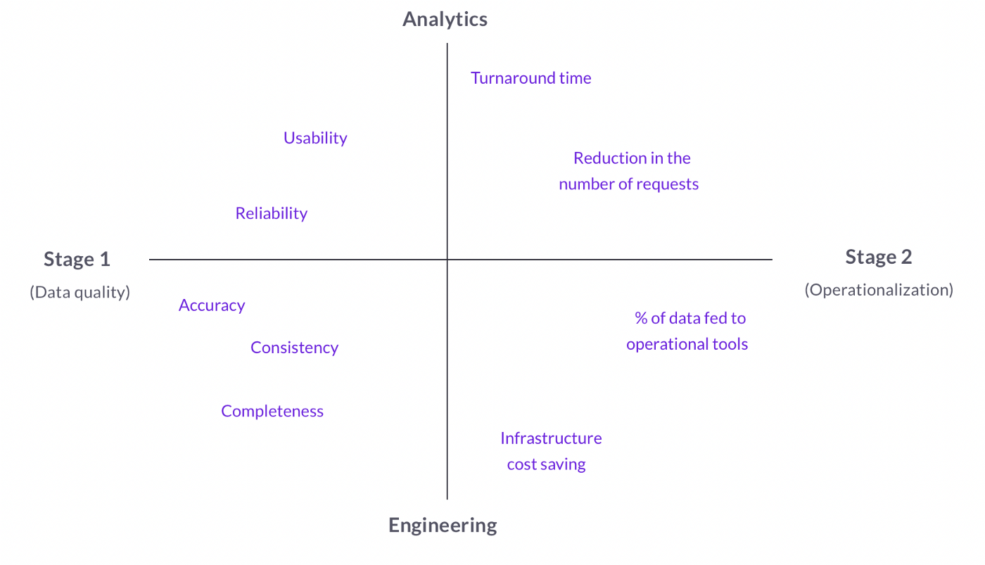
A. Two key stages of data teams and their respective KPIs’
I) Stage 1: Clean data
The first priority of a new data team is to have clean, usable, and trusted data. If you don’t have that, there is no way data can ever impact the overall performance of your business. In the very early stage of your data team, you thus need to ensure the data is good, and your job is to polish up your data until it’s in the best possible shape. Naturally, the first KPIs’/metrics you will measure are thus linked to data quality. Data quality is the umbrella term encompassing all the factors influencing whether data can be relied upon for its intended use. The first data ROI you measure is therefore tied to whether you can obtain answers from clean data. Here are the most important elements to measure to ensure your data is at least 80% good. For more content about data quality dimensions, this article from Metaplane is a great resource.
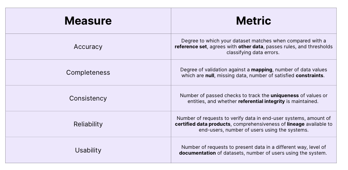
- Accuracy
Accuracy is related to whether the data you have describes reality. For example, you have an accuracy problem if the number of items you sold this month in the data warehouse disagrees with the actual number reported by the sales team.
Key metrics to measure accuracy: “the degree to which your dataset matches when compared with a reference set, agrees with other data, passes rules, and thresholds classifying data errors.” (Kevin Hu, 2021)
2. Completeness
Completeness has to do with how completely your data describes reality. the two levels of completeness are the following: first, you need to look at how complete your data model is. Second, you should look at how complete the data itself is relative to the data model.
key metrics to measure completeness: “Degree of validation against a mapping, number of null data values, missing data, number of satisfied constraints.” (Kevin Hu, 2021)
3. Consistency
Consistency refers to whether your data is internally consistent. Data is inconsistent when aggregations of different values don’t correspond to the supposedly aggregated numbers. For example, you have a consistency issue if the monthly profit is not consistent with the monthly revenue and cost numbers. An example of a consistency check is Codd’s referential integrity constraint.
key metrics to measure consistency: “Number of passed checks to track the uniqueness of values or entities, and whether referential integrity is maintained.”(Kevin Hu, 2021)
4. Reliability
Reliability has to do with whether the data in your warehouse is regarded as true by data users. Your data can be regarded as reliable when you have sufficient lineage and guarantees about its quality. if your sales team believes that product usage does not reflect real usage because of a technical issue, you’re facing a data reliability problem. A data catalog can usually help you get fast proof of data reliability.
Key metrics to measure reliability: “Number of requests to verify data in end-user systems, amount of certified data products, comprehensiveness of lineage available to end-users, number of users using the systems.”(Kevin Hu, 2021)
5. Usability
This refers to whether data can be accessed and understood smoothly. Data usability is good when data is easy to understand and interpret correctly, in an unambiguous manner. You have a usability problem when a Looker dashboard is hard to interpret. In general, enriching your data with metadata (i.e documenting your data) makes it usable and easy to interpret on the go.
Key metrics to measure usability: “Number of requests to present data in a different way, level of documentation of datasets, number of users using the system.” (Kevin Hu, 2021)
II) Stage 2: Operationalization
Once you have clean, reliable data at your disposal, the next step for improving performance is to engage in operational analytics. This approach consists in making data accessible to “operational” teams, for operational use cases (sales, marketing, ..). We distinguish it from the more classical approach of using data stored in the warehouse only for reporting and business intelligence. Instead of using data to influence long-term strategy, operational analytics informs strategy for the day-to-day operations of the business. To put it simply, it’s putting the company’s data to work so everyone in your organization can make smarter, faster decisions.
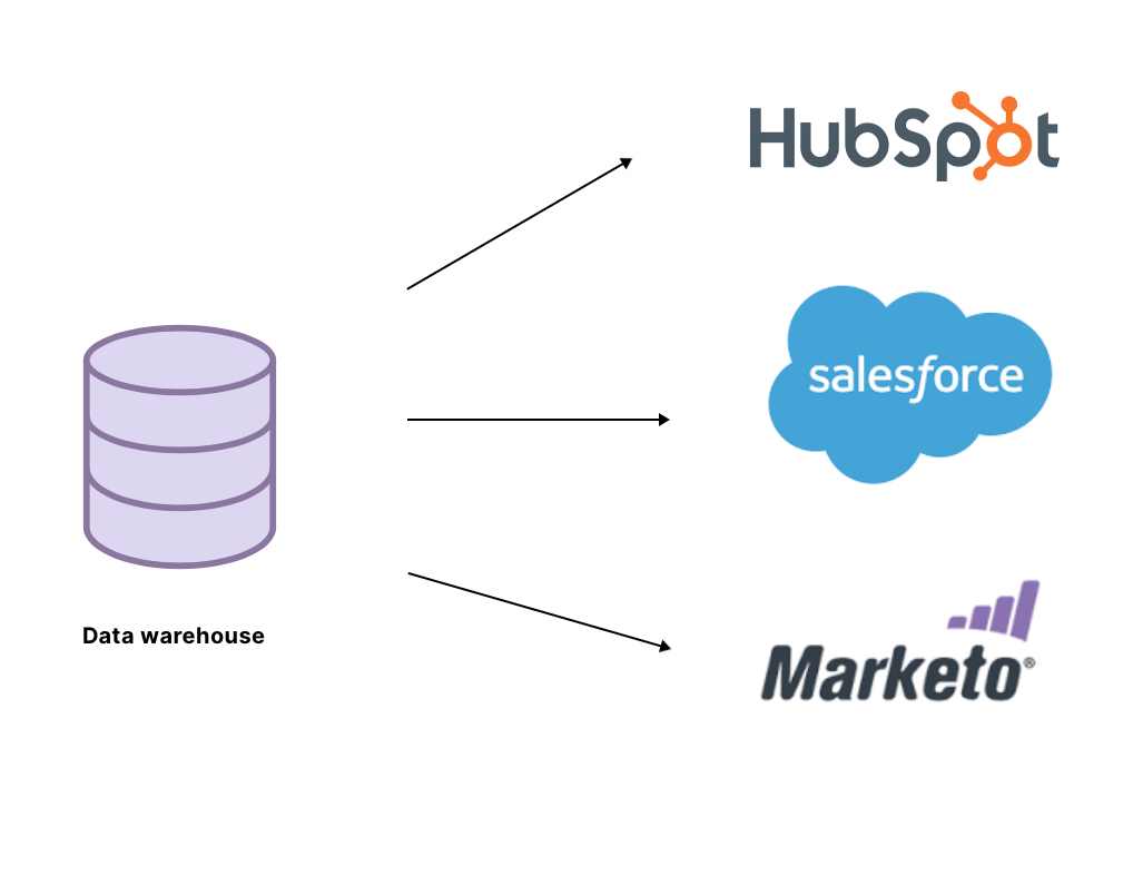
This comes as a very natural step in the evolution of data teams. The ultimate goal of collecting data is to improve efficiency and decision-making in organizations. It follows that you should measure how well you can put data in the hands of other teams so that they can use it in an independent manner. This means pushing the data into operational tools so that the sales or marketing team can use it efficiently in their campaigns. Reverse ETL tools are great for data operationalization, allowing you to automatically push data from your warehouse into the operational tools of other teams.
There are two benefits of data operationalization that should allow you to boost your ROI. First, it allows other teams to make more efficient, data-driven decisions. Second, this frees up the analytics team for deeper, more meaningful data analysis. When analytics can move away from basic reporting, providing data facts to other teams, and answering tickets, they can focus on what we really need analysts’ skillset for.
But how can you then measure your ability to roll out data in self-service?
Julie Beynon, Head of Data at Clearbit recommends thinking of this in terms of the number of problems you solve for other teams. You can specifically look at the reduction in the number of requests in a specific category. For example, the data team might get a lot of requests about attribution. Putting the relevant data in the hands of the marketing team should lead the latter to be less dependent on the data team for this kind of problem, ultimately driving the number of attribution-related requests to zero. A good measure of how well you’re operationalizing your data is to look at the reduction in the number of requests in various categories. And the more you can tick problems off the list, the more your data is operationalized.
This idea also appears in a famous Data ROI framework proposed by HEX. This framework s postpones that if your data team is truly providing value, the leaders of other functions such as Marketing or Finance will strongly advocate for more investment in the team on your behalf. If, on the contrary case, your partners are not willing to defend your case, you probably aren’t operationalizing your data. That is, other teams are not benefiting from your work, or you’re not allowing them to be independent with data.
B. Different ROIs for different sub-teams.
We’ve established that you should look at different metrics according to the stage of your data team. But that’s not it. Data teams are made of sub-teams, and these sub-teams should be evaluated according to different KPI’s/metrics. We distinguish the two main following sub-teams: Engineering and Analytics. Each of these sub-teams has different goals and impacts the business in a different manner, hence why they should be evaluated differently.
In a very cool article about measuring the ROI of data work, Mikkel Dengsøe introduces the difference between system people and KPI people. We make this difference simpler and we’ll just talk in terms of Engineering (systems people) and Analytics (KPI people).
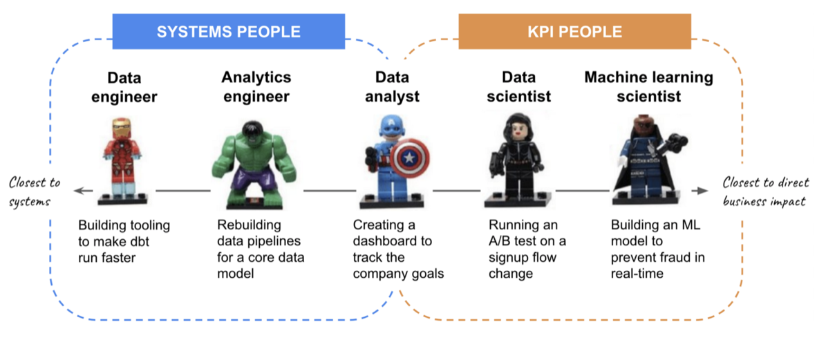
I) Engineering (system)
The data engineering team’s goal is to build a reliable infrastructure to ensure Analytics have access to trusted data. The following metrics are thus best adapted for measuring their performance.
Multiplier effect
Engineers’ work doesn’t directly impact top-level KPI. The peculiarity of their job is that it acts as a “multiplier effect”, allowing the analytics team to work faster and more efficiently. For example, if data engineers can make dbt move faster, Analytics Engineers can move quicker too and build more data models. Without the engineering team, data analysts and data scientists would spend 70%-80% of their time cleaning data. Having a strong engineering team increases the performance of the analytics team, which in turn positively impacts the performance of other teams.
But how do you measure the multiplier effect? Well, the data engineering function allows others to move faster by providing clean, reliable data to other teams. As such, the key metrics to measure the performance of data engineers are data quality and data uptime.
Data quality
We’ve detailed the components encompassed by data quality in part I. In a more general manner, data quality can be measured by the number of incidents triggered by data issues. We can define data incidents as including internal alerts, failed tests, and issues raised by external consumers when relevant.
Data uptime
Data uptime can be defined as the percentage of time a dataset is delivered on time, relative to the expected frequency or SLA requirements.
Expected frequency refers to how often a dataset is expected to be updated. This is most commonly daily, hourly or real-time.
SLA (Service Level Agreement) Requirement is the frequency clause stipulated by an SLA agreement between a data producer and consumer for when data must be updated by. For example, an SLA might state an absolute time like 7:00 am or a relative time like every 3 hours.
Infrastructure cost saving
We were initially surprised to hear that in KhanAcademy’s data team, it is common to look at infrastructure cost savings when gauging the performance of analytic engineering teams. Let’s think about why this could be revealing to measure.
Apart from providing clean and reliable data to other teams, data engineers are responsible for good data management. This includes cleaning tables, archiving unnecessary ones, and taking full advantage of what the cloud has to offer. It turns out that good data management saves tremendous amounts of money in storage costs. Similarly, data engineers generally seek to automate processesor make them more efficient. And this saves time, and thus money. Infrastructure cost-saving thus comes as a natural consequence of a well-performing data engineering team. In this sense, it’s a very interesting metric to look at when measuring the performance of your team. Of course, you need to be cautious and always look under the hood to uncover why costs are falling. Is your team being more efficient (good sign) or are they simply processing much less data than before (less good)? Regardless of the answer, this number will tell you something, on top of being super easy to measure.
II) Analytics (KPI)
Analytics teams work in a different manner. They have a more direct impact on business KPIs, or at least they work closer to decision making. And evaluating their performance should take that into account.
On the analytics side what’s really important is the turnaround time between when a question is asked, and when an answer is provided. Analytics’ job is to provide fast answers to key questions so as to enlighten decision-making in the business. The goal is to minimize the time between a question asked and the answer given by the analyst, and measuring this time should give a good indication of the team’s performance. This framework has initially been proposed by Benn Stancil, and has proved to work well in KhanAcamedy’s data team.
The great thing about measuring analytics performance this way is that it encourages analysts to focus their work on real-life decision-making, avoiding them getting lost in exploratory data analysis.
What does your Analytics team focus on? This tells a lot about data ROI in your business. Very simply, if your team spends most of its time answering tickets for other teams (Marketing, Finance, etc…), it means your data is not operationalized. Other teams are fully dependent on the analytics team for data questions, and you’re failing to achieve self-service with data. This also means your analytics team spends too much time running, solving day-to-day business problems and basic reporting instead of building and focusing on deeper level analysis. Although this metric can’t be measured adequately, it gives you a good idea of where you are in your data journey. This alsohelps you identify which metrics you should be focusing on. If your data is not fully operationalized, you should probably spend more time on data quality, ensuring you have clean & trusted data.
Conclusion
These reflections bring us to a sweet conclusion and a relatively simple solution to the conundrum of Data ROI. Once you’ve understood the current challenge for your data team (data quality or data operationalization), identifying the metrics you should be looking at for measuring performance is very straightforward. We’ve tried to make things even simpler through this cool mapping. Here’s how to read it. Your data team is relatively young and you haven’t solved the data quality issue yet? This means you’re at stage 1. You should pay attention to metrics such as data accuracy, consistency, and uptime to evaluate the performance of the engineering function, while you should at documentation efforts and data usability to measure data analysts’ performance. As simple as that.
Subscribe to the Castor Blog
About us
We write about all the processes involved when leveraging data assets: from the modern data stack to data teams composition, to data governance. Our blog covers the technical and the less technical aspects of creating tangible value from data.
At Castor, we are building a data documentation tool for the Notion, Figma, Slack generation. We designed our catalog software to be easy to use, delightful and friendly.
Want to check it out? Try a free 14 day demo of CastorDoc.
.png)
You might also like

.png)
Get in Touch to Learn More


“[I like] The easy to use interface and the speed of finding the relevant assets that you're looking for in your database. I also really enjoy the score given to each table, [which] lets you prioritize the results of your queries by how often certain data is used.” - Michal P., Head of Data
