

DX is the new UX
The rise of the Data Experience
In the past decade, most of the innovations in the data ecosystem were focused on producing more data. It worked, and just as UX became important as digital products proliferated, DX has taken an important place as data products have burgeoned.
In fact, 20 years ago, data was the realm of IT teams and a few data wizards. Even 5 years ago, it was still very much owned by data teams. Today, data powers all the operational functions within a company: sales, finance, marketing, ops, and more. Thanks to reverse ETL, BI tools, and self-service, business teams use data as part of their day-to-day operations.
In short, business users have become data users and their experience has become a Data Experience. The Data Experience is how these domain experts feel when they use data daily to superpower their job.
The Data Experience is not new. The industry has been talking about it for a while now. It’s also close to the concepts of data mesh and data products which were on everyone’s mind last year.
The consensus was easy to reach: The Data Experience is broken and needs a fix. In fact, the data ecosystem is fragmented, making it difficult to unify workflows and provide a smooth experience between the tools.
The bad news is, if we wait for the ecosystem to come up with a solution, we’re headed for a long while of silent suffering. The ecosystem is unlikely to converge into a single unified solution that suddenly provides a good Data Experience across the full stack, from data ingestion and warehousing all the way through to transformation and visualization. What do we do until then?
Our challenge is to make the Data Experience better starting from where we already are, with our existing people and our existing tools.
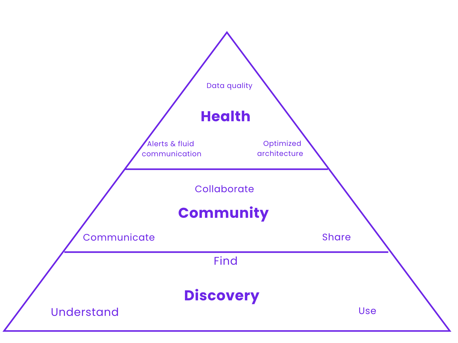
This article seeks to define what a good Data Experience looks like. An experience goes further than tools and organizational frameworks. For us, a good Data Experience means reaching excellence in the three following areas: Discovery, Community, and Health. We’ll dive into what excellence in these three areas looks like in the following section.
What does a good Data Experience look like?
Our view of what a good Data Experience looks like rests on three pillars: Discovery, Community, and Health. The three elements and the product of their interactions are what make up the bulk of the Data Experience. Each category encapsulates a lot of overlapping tools and concepts. For the purpose of this article, we avoid getting into crunchy details which we keep for the later series. Let’s look at each of these pillars in more detail. First, you need to find & understand what you have. Then, as you grow it must be easy to share & communicate around it. Once things are discoverable & useable as a team, you can now improve health because you can discover effectively the data assets & communicate problems as they arise. It’s the Maslow pyramid of the Data Experience.
Discovery
The first pillar of the Data Experience is data discovery. Unlocking data discovery means that people in your organization can Find, Understand and Use their data assets smoothly, and efficiently while minimizing unwanted interactions between different teams. The idea is that an experience is a workflow with several steps. Improving that experience comes down to removing the blockers at each step of the process.
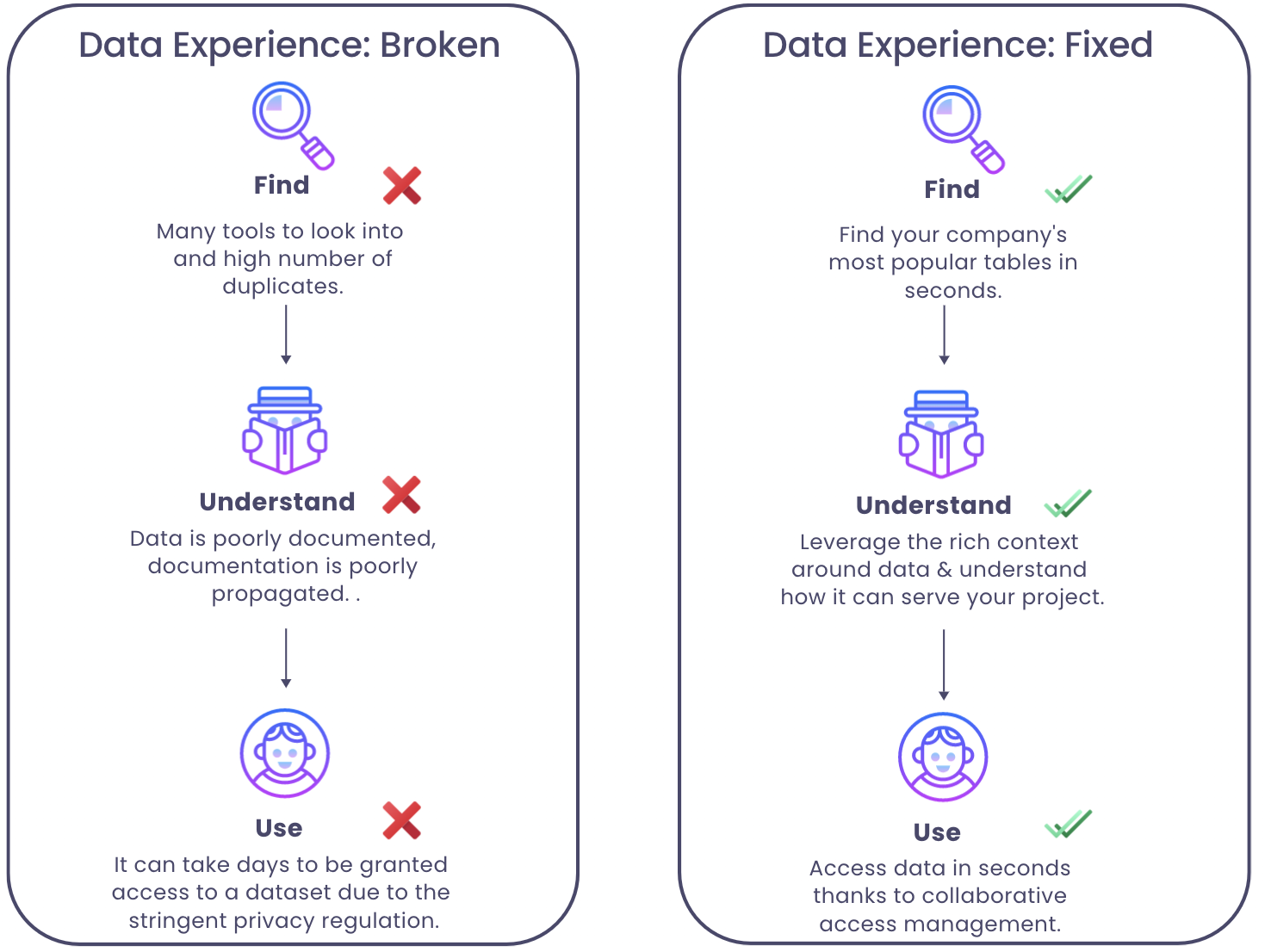
Find
A good indication that data is “findable” is when data engineers stop being treated like a data catalog. That is, people stop pinging them on slack asking where to find a specific dataset, and whether it is reliable to use for a given report.
This means everyone in the company knows where and how to find the best data for their specific project. Even if data is messy. Even if there are 20 tables bearing the almost same name.
So what does “good” look like? Data is findable when teams can easily navigate across the mess, and identify effortlessly which are the most popular and up-to-date tables without asking their colleagues or boss. Improving the data discovery pillar of the Data Experience goes through removing all friction points related to knowing which data to use.
Again, this can be achieved in a lot of ways: deprecating useless tables or documenting your data. Regardless of the path taken to arrive there, you should be aiming for an experience where people NEVER struggle to find a dataset.
Understand
People understand a dataset when they are aware of the needs this data will satisfy, its content, and its location. Data without context is worthless & dangerous. Once you found the relevant dataset, you did 10% of the job. Now you need to go through a checklist of 10+ questions to make sure you understand what data you are using. If you can’t answer the following question, you don’t understand your data.
- Where does the data come from?
- Where does it flow and which tables does it feed downstream?
- Who owns it / who is responsible for it?
- What is the meaning of a given field in my domain?
- Why does it matter?
- When was the last time this table was updated?
- What are the upstream and downstream dependencies of this data?
- Is this production-quality data?
People can truly understand the data when all the relevant knowledge is tied to it. Understanding is subjective. An ML engineer will approach a dataset differently than a data analyst. This is why all understanding goes through tying all the relevant knowledge layers to a dataset.
Use
There are two necessary conditions for people to use and leverage data. People need to access the data and gather enough context around it to know which use case it is good for.
Access used to be straightforward. Not anymore. Tight regulations such as GDPR or HIPAA require data access to be firmly controlled. With the data volumes we’re dealing with today, it has become hard to find the right balance between data governance and data accessibility. It’s hard to protect information while ensuring that people can access the dataset they need, at the exact moment they need it.
Query your data. Obtain the answer you need from it in seconds. A good Data Experience makes it super easy for anyone to query the data, with or without code. Kickstart your analysis by browsing through what domain experts already did. Reuse the powerful queries written by experienced data people in your team. Say goodbye to duplicate work. Querying the data should be made an incredibly easy step, regardless of people’s backgrounds. Queries allow people to leverage the data and obtain answers to their questions.
Community
Community is a fundamental pillar of the Data Experience. Community is defined as “a feeling of fellowship with others, as a result of sharing common interests, and goals”. Regardless of which form community takes in your organization, creating this feeling is key.
In fact, there are no room for silos in a data team. Silos set you on a highway to failure. Data Engineers, Analytics Engineers, Data Scientists, Data Analysts, and Business Analysts all share the same goal: leveraging data to help their organization flourish. They’re in the same boat, which is why it’s important for them to feel that they are.
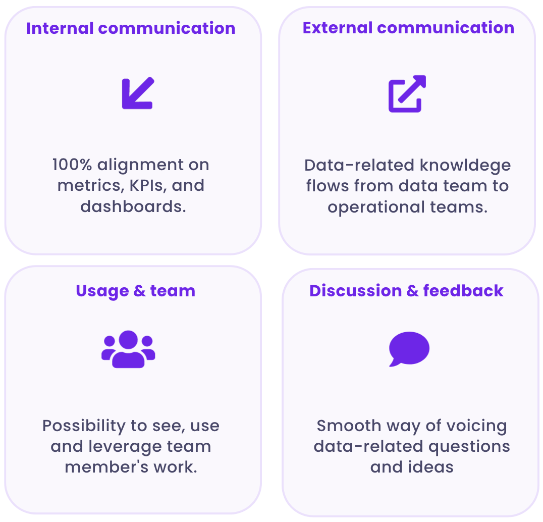
Solving community for data teams entails four components:
- Internal communication and alignment. Inconsistency over metrics and business definitions is still a painful issue in modern organizations. It’s hard to agree on KPIs that matter for everyone, and definitions live in different tools of our fragmented data stack. Teams should seek an experience where the internal data practice is 100% aligned on metrics, KPIs, and dashboards. A world where data assets are certified, and where you have only one definition for “Active Users” (I know, right?). Even if your team uses dozens of data tools, everyone should be equipped with the same information.
- External communication. Too often still, data knowledge never leaves the data team. We should aim at building a Data Experience where data flows seamlessly between the data team and other stakeholders. Operational teams should be able to access a non-technical overview of data knowledge within their everyday tools. Regardless of departments, roles, tenure, and data literacy levels, employees must understand data to work efficiently. Community ensures data knowledge doesn’t get stuck in data teams.
- Usage and team. Currently, there is a lack of transparency regarding data usage in organizations. It’s impossible to see how people have transformed, queried, and used a given dataset. This results in a lot of duplicate work which could be easily avoided by giving people a sneak peek of data usage. Let your team understand that they are not alone. A good Data Experience enables employees to see how other people are using data. It allows everyone to reuse and leverage the work their team members have already done. Being conscious of others’ consumption is stirring up the feeling of fellowship that defines community.
- Discussion and feedback. Teams would benefit from an experience where they can easily communicate and voice their ideas. Currently, the only way to answer a question related to a dataset is to ping 10 colleagues on slack in the hope one will reply. Decentralization and remote work should make us extra conscious of the need to create interfaces allowing smooth communication within the data team, AND between the data team and other data stakeholders. This might take the form of a chat attached to each dataset, for example.
Health
.png)
A good Data Experience starts with a healthy data environment. By this, we don’t mean your data should follow a keto diet and engage in a daily 18 hours of intermittent fasting.
Healthy data should come as a natural consequence of Discovery, Community and a strong Governance framework. It is very straightforward why. Data health describes how well an organization’s data champions its business objectives. Healthy data is data that is easily discoverable, understandable, and valuable to the people who need to use it.
Healthy data means that everyone in the organization can access the information they need, when they need it, and use it without wondering about its validity. Healthy also means that you know how your data assets are related. if you don’t have a clear vision of how assets are related, you can deprecate the table that feeds your CEO favorite dashboard without even realizing it.
Healthy data should also keep these attributes throughout the whole data lifecycle. This is far from straightforward. Modern data pipelines are complex and display black-box features. You know what goes in, you know what comes out, but you have no clue of what happened in between.
It’s fine as long as the desired outcome comes out. But when it doesn't, it's highly frustrating. When data sets come out of the pipeline, you are often left with strange values, missing columns, letters in fields that were meant to be numeric, and so on.
For this reason, healthy data is observable data. Its status should always be explicit: you should be aware if upstream processes are operating irregularly, out of date, or are simply broken. Data observability tools can do a lot in terms of monitoring the health of your data systems. They allow you to spot incidents quickly and intervene when your data is broken.
A healthy data environment displays these characteristics:
- A clear understanding of what data is available and how it can be used to benefit your organization.
- A culture of trust between all parties involved in managing the data.
- A robust security system to protect against unauthorized access or misuse of said data.
- A plan for adapting to new technologies as they become available.
The Data Experience in a fragmented ecosystem
Now the question is: how do you make this happen for yourself? The answer does not lie in waiting until the ecosystem figures things out and finally decides to integrate. We need to do with what we have: The people we have, the tools we have, and the data we have. This series is about leveraging our existing ecosystem to improve the Data Experience of our teams. Again, a good Data Experience can take many shapes, as long as it is built upon a rock-solid discovery pillar, a strong sense of community within data teams, and a healthy data ecosystem.
Subscribe to the castor blog
About us
We write about all the processes involved when leveraging data assets: from the modern data stack to data teams composition, to data governance. Our blog covers the technical and the less technical aspects of creating tangible value from data. If you’re a data leader and would like to discuss these topics in more depth, join the community we’ve created for that!
At Castor, we are building a data documentation tool for the Notion, Figma, Slack generation.
Or data-wise for the Fivetran, Looker, Snowflake, DBT aficionados. We designed our catalog software to be easy to use, delightful and friendly.
Want to check it out? Reach out to us and we will show you a demo.
.png)
You might also like


Get in Touch to Learn More

“[I like] The easy to use interface and the speed of finding the relevant assets that you're looking for in your database. I also really enjoy the score given to each table, [which] lets you prioritize the results of your queries by how often certain data is used.” - Michal P., Head of Data
